Mobile Responsive Design
Mobile Responsive Design Services
Mobile responsive design ensures that your website looks great and functions perfectly across all devices—smartphones, tablets, laptops, and desktops.
4.8 Rating
50+Reviews
Google Partner
Empowering Businesses with Google Certified Expertise.
Professional Mobile Design Solutions for Every Business Need
Professional mobile responsive design goes beyond just shrinking content to fit smaller screens. It involves rethinking user interactions—touch-friendly navigation, thumb-friendly buttons, quick-loading images, and streamlined forms—all designed to enhance usability on mobile devices. By improving the mobile user experience, businesses can increase conversions and build trust with their audience.
- Expertise in Digital Solutions
- Innovative Design Approach
- Strategic Digital Marketing
- Data-Driven Decisions
- Holistic Security Measures
- Tailored Digital Strategy
- Responsive & Scalable
- Proven Track Record
Send us an Email
Our Services
Our Core Mobile Responsive Design Services

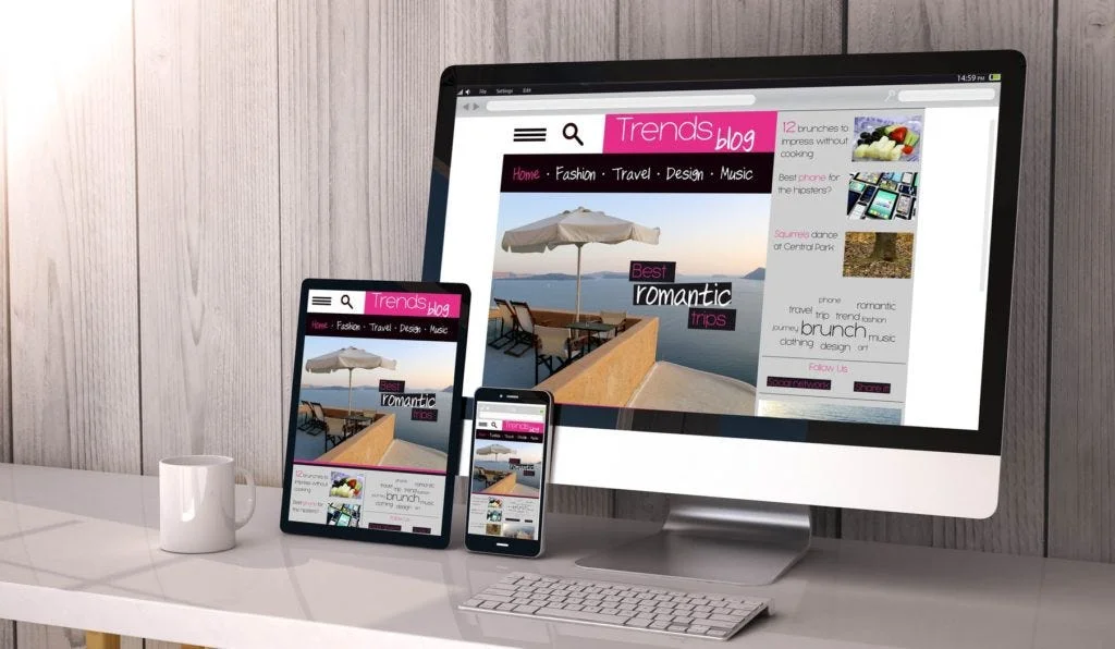
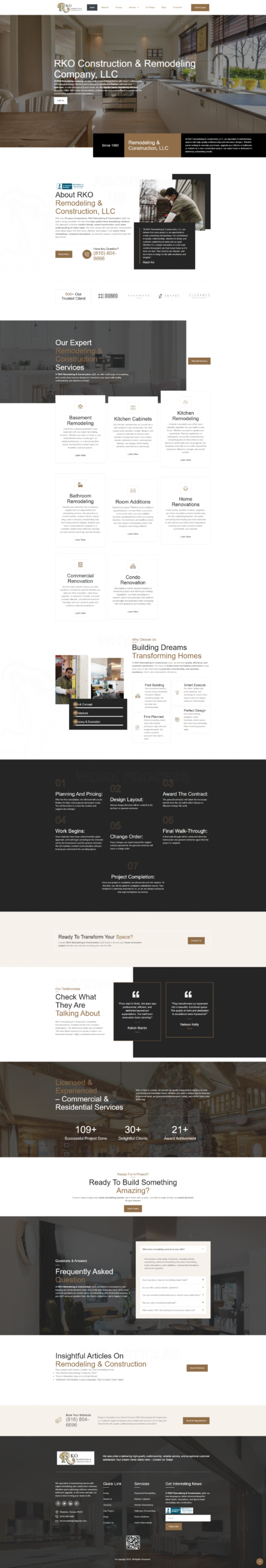
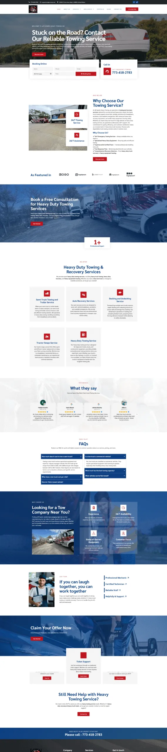
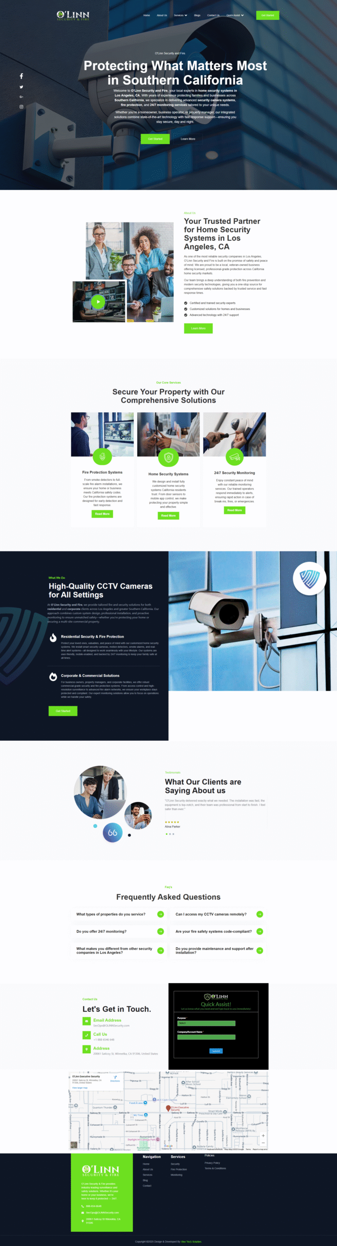
Custom Responsive Website Design
We create tailored, mobile-friendly websites that adapt to all screen sizes while maintaining visual appeal and strong brand identity.

Mobile UI/UX Optimization
We enhance the mobile experience with intuitive navigation, touch-friendly elements, and streamlined user interfaces for maximum usability.

Cross-Device & Browser Compatibility
We ensure your site functions flawlessly on all major devices and browsers, delivering a consistent, high-quality user experience everywhere.
Pioneering Digital Excellence: Discover the Absolute Rankers Advantage.
At Absolute Rankers, we are more than just a website story or the best social media marketing agency; we are your partners in digital hits. Our goal is to help businesses thrive in the rapidly transforming digital world.